Newsletter preheaders

How to maximize newsletter opening with preheaders?
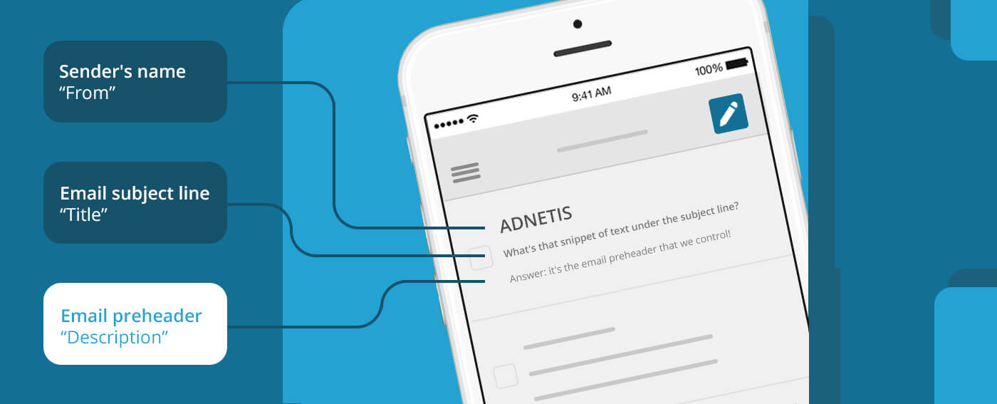
THE PREHEADER: THAT LITTLE LINE OF TEXT THAT APPEARS BELOW THE EMAIL SUBJECT IN THE INBOX!
An eye-catching preheader is a key step towards opening a newsletter. Failing to master this element of your campaigns reduces your chances of achieving your communication goals. It’s the equivalent of opening a pantry full of canned goods with product labels that have no description. Cube tomatoes or whole tomatoes?
By controlling the preheader that appears below the email subject line, you’ll give a glimpse of the content of your newsletters, and attract more interest to encourage people to open them!
What is a preheader?

The email preheader is an introductory text to the content of an email. Displayed below the email subject in the inbox, it serves to elaborate on the content in order to generate more opens.
In email marketing, we learn to control the preheader to maximize the communication experience. Thanks to the preheader, you can more easily convey the objective of your message to your subscribers by leveraging your marketing-flavored writing skills.
The value of having control over your preheader!

Technically, your email preheader (preheader) is much more than just an introduction to your message. The simple fact of creating an email preheader rather than generating one by default has essential advantages.
Here are just a few of the benefits:
Increased credibility
– A professional preheader gives your subscribers confidence and encourages them to take your newsletter seriously.
Strong brand recognition
– A well-crafted preheader strengthens your company’s overall branding by creating clean, organized email messages.
Reduced risk of spam
– A readable preheader reduces the risk of people identifying your emails as spam.
Improved open rate
– An eye-catching header generates interest, encouraging your audience to open and read your message.
No email subject line has a 100% approval rate. This further reinforces the importance of the preheader as the last line of attack in convincing people to open your communication.
Various preheaders scenarios

If you pay attention to the email preheaders you receive from various sources, you will find three typical cases:
- The header line is empty;
- A mixture of incomprehensible code and links;
- The first elements found in the newsletter;
- Text specially designed to support the subject line.
What explains the different display types? The answer lies in the fact that some email marketing platforms simply don’t offer the option of personalized preheaders. Or the sender doesn’t pay particular attention to this important detail when producing newsletters!
😐 Newsletters WITHOUT preheaders
Inconsistent preheaders:
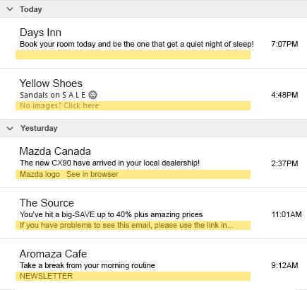
If you don’t control the preheader, inboxes will display the first elements they find in your newsletter. Since the “View this email in a browser” functions can be found at the top of newsletters, it’s often this text that will appear at the preheader spot.
The empty preheader:
In 99% of cases, if you see an empty preheader, it’s simply because the inbox can’t display the element, because it’s too long: “https://www.solutions-emailing.com/image/adnetis/2023/aout/entete-courriel.jpg”.

😊 Newsletters WITH preheaders
Lucky preheaders:
As you’ll have realized, inboxes display the first elements they find in newsletters. If you haven’t specified a preheader and the text displayed makes sense, you’re lucky. The first part of what you’ve composed in your newsletter will have served as the prerheader, no matter what you’ve written.
Controlled preheaders:
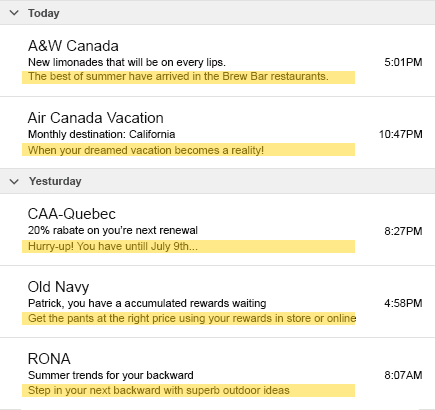
Controlling your preheader is the act of deliberately placing text in a designated box. Essential to a complete communication strategy, controlled preheaders can create a significant advantage!

Winning writting tips!

Now that you know the importance of controlling that little bit of text in the inbox, it’s time to sharpen your pen!
To stand out from the most experienced competitors, you need to leave an indelible impression on your audience with punchy, effective headers…
Here are a few tips for writing great email preheaders:
1. Focus on customization
From the very first words, display the subscriber’s “First Name” to demonstrate that the content is personalized, even if it isn’t.
“Renew Sophie’s subscription in order to…”
2. Spark curiosity
Be enigmatic and reveal only part of the information involved. Ask an intriguing question or declare a surprising piece of information.
“International artist returns to Gatineau on…”
3. Push the call-to-action
Mention the action you want your subscribers to perform. You’ll optimize the rate of clicks towards the objective of your communication.
“Click on the program to view…”
4. Target interests
Demonstrate that you understand your subscribers’ interests and know why they signed up for the newsletter.
“Volunteers, unlock your creative potential by…”
5. Promote exclusivity
Demonstrate that newsletter content is sent exclusively to subscribers, reminding them of the benefits of subscribing.
“Your exclusive invitation has just been issued…”
6. Use the right words
Use words that are relevant to your audience. Avoid technicality if you’re talking to the general public, and dare if you’re talking to professionals.
“The FRGQ propeller sprockets series…”
7. Change your habits
Use them with moderation, but if you’re used to being traditional in your newsletters, surprise your audience from time to time.
“Yet another $&#*! newsletter from us…”
8. Prioritize proximity
Use your geographical data to prioritize local shopping, or simply draw attention towards personalized content.
“Only for residents of the downtown area…”
9. Tell a story
Tell a funny inside story to increase the sense of loyalty and interest in the organization’s staff.
“Guess who’s been eating the chocolates again…”
10. Fuel the emotion
Mention the emotion the newsletter should stimulate to temper the atmosphere before opening. A word has the power to anticipate favorable reactions.
“You’ll be overjoyed to learn that…”
Further expert tips and tricks to deploy!

Sprinkling your newsletter preheaders with extra tips to create a winning recipe for all your campaigns is worth considering if you’re planning to enhance the inbox landscape.
Put these additional tips into practice:
Avoid spam words
Avoid words or actions that may trigger spam filters. Just like email subject lines, certain words can send your newsletters to trash!
See details on spam words to avoid as a reference!
Write enough text
We STRONGLY recommend a heading of at least 40 characters. Why we say so? Depending on the inbox, the concept of displaying the first elements found in your newsletter will show after your preheader if it’s too short.
So, for example, we’ll find your headline “The vacations are just around the corner” followed by “If you can’t read this e-mail…”. You want to be in control from A to Z, so opt-in for the ideal 130-character preheaders to display text that’s appropriate in all circumstances.
At worst, recycle!
If you don’t know what to write in your email preheader, simply recycle a portion of text already present in your newsletter. You don’t always have to write preheaders. Sometimes, just making sure the header makes sense is enough!
Test your preheaders
- Make sure your preheaders are optimized for mobile devices.
- Monitor the performance of your preheaders and adjust them according to the results obtained.
- Experiment with different preheaders to identify the most effective approaches.

Jérémy Bergeron
Administrative Assistant
Want professional advice?
Young and dynamic, Jérémy knows the new media and the potential of a successful email marketing campaign.
Get more details on preheaders in newsletters by contacting him now! He will be able to offer you innovative and creative solutions for your email marketing campaign.
E: jbergeron@adnetis.com
P: 1-877-638-6584
