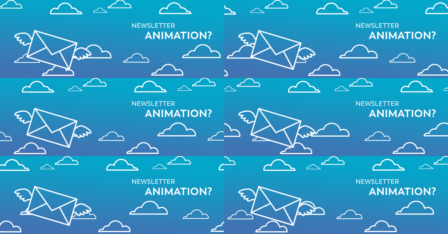
Newsletter animation

Should you use animation to capture attention?
Newsletters that feature an animation are more likely to catch the attention of subscribers, but some technical elements need to be taken into consideration when creating your animations!
We animate what?
Previously, when our customers were talking about animation … the thinking was to find imaginative concepts to animate the entire newsletter.This idea of having to animate everything brought a lot of challenges:
- Finding an artistic designer with 3D animation skills was expensive.
- Animated emails deliverability was a challenge since the email only contained the animated image.
- The majority of inboxes did not animate the image.
Fortunately, technology and mentalities are changing! Henceforth, it is no longer necessary to hold advanced knowledge in 3D animation, since we no longer animate entirely newsletters.
We now understand that the animation is mainly used to attract the recipient’s attention to a key element rather than trying to create a fully dynamic newsletter. In doing so, the reading of the email is made possible without having to download the image which constituted the essence of the email. In addition, the deliverability is no longer impacted by the animation since mobile phones automatically display it.
Let’s see how animation can be used to maximize the performance of an email marketing campaign:
Call to action
It’s no big WOW here! A simple animation like a flashing button can make a real difference in your clickthrough rate towards reaching your campaign goal. We are not talking about total animation, but about a segment that will catch the eye of the subscribers on the desired action.

Focus on an item
Your newsletter is promoting a clothing collection? Focusing on items with an animation will lighten your content and focus on a clear and concise message … promoting your clothing collection! The animation of your products, however light it will distinguish you from your competition while allowing you to maximize your conversions.

Feature Demonstration
The subject of your newsletter is complex? Expose the benefits of your solution with an animation. Although it is not a complete tutorial, it will be useful for illustrating the generic concept and will be easily understood by your subscribers.
Do you offer revolutionary lawn mowers that spread lawn seed? Animate your mower to demonstrate its function and benefits. Your clickthrough rate to the details of this product will be significantly higher!

Maximize conversions
Using an animation adds an element of fun to your campaign. A small movement is often enough to surprise the reader, to generate interest and to click on a landing page. Appealing to the curiosity of your recipients with an element of surprise can drastically increase your clickthrough rate to your website.

How to animate a newsletter?
- Consider that some inboxes (Outlook) will not animate your GIF. They will only show the first frame of your animation. So be sure to summarize the essence of your message from the beginning by avoiding starting the animation with a fade in effect. If you’re running a banner with an existential slogan, make sure it’s there from the beginning.
- Reduce and optimize your animation file. In an increasingly mobile world, the size of your file will make a real difference in the quality of your campaign. Large GIFs are part of subscribers’ data plans and are slow to download. In short, you do not want to frustrate your audience.

Sylvain Trépanier
Software developper specialist
Want professional advice?
The deployment of new features in our email marketing software is overseen by this application programming interface (API) specialist.
Get more details on newsletter animation by contacting him right now! He will be able to assist you in a special project management tailored to your business needs.
E: strepanier@adnetis.com
P: 1-877-638-6584
